Picking the Shield Logo in Palermo


SHIELD seeks to address gender-based violence (GBV), in particular stalking, sexual harassment, dating violence and online grooming among youth through innovative Artificial Intelligence (AI) based solutions, enhancing detection and intervention strategies. By empowering youth workers with digital tools and resources, the project aims to foster safer environments, improve GBV awareness, and influence policy at national and European levels for sustainable change.
Picking a Logo at the Kick Off in Palermo
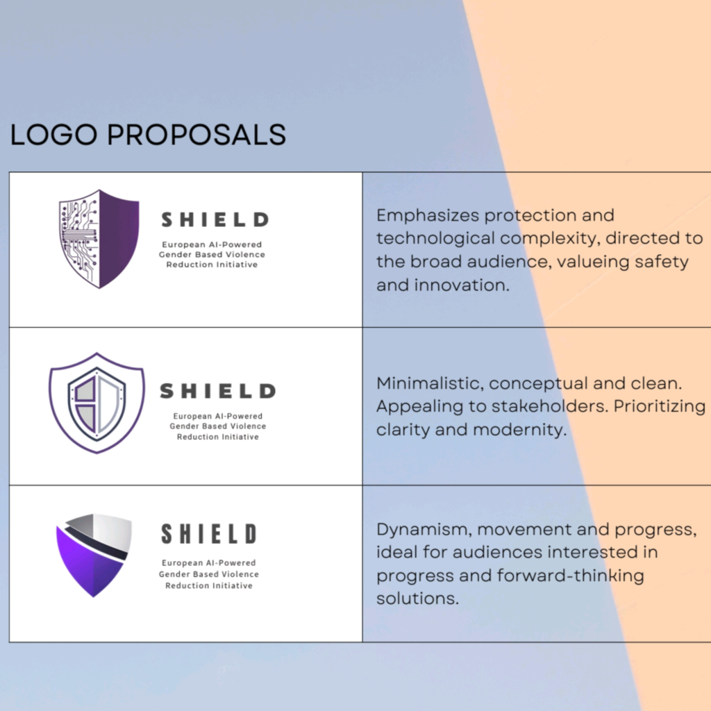
The kick off meeting in Palermo on December 3rd 2024 was focused on the set up, interim reports, deliverables and milestones during the 3-year project duration. One of the important decisions to make is the project logo. The Dutch Foundation is responsible for communication and dissemination work packages, including the design of the Shield logo… The shield is a universal symbol of protection, strength and security, attributes directly related to the mission of our project: to combat harassment and violence against women through the use of artificial intelligence tools. The shape of the shield visually conveys the idea of safeguarding and empowering, being a clear reference of trust and defense.The choice of colours plays a fundamental role in conveying the values and mission of the project. The purple and grey colour palette is much more than an aesthetic choice – it is a reflection of the project’s values and purposes. Purple represents the fight against gender based violence, while grey symbolises the technology that allows us to advance in this matter. Together, these colours create a powerful visual identity that communicates both emotional commitment and technological innovation.
Below the mock ups designed:

The partnership has chosen logo nr. 1 as the best logo visualizing the brand and indentity of the Shield-project.
